The purpose of a sign-off in business emails is to signal the end of the message. It also reminds the recipient who the author of the email is and what his or stand is in the company they represent. Obscure email endings, as well as vague messages, can significantly decrease email response rates. In order to ensure a desired result (i.e. a response or conversion), it is important to follow certain guidelines on signing off business emails. Below are some insights collected from digital communication professionals and etiquette consultants.
First of all, an email endings should include the following: a closing line, a signature, and contact information.
Closing lines
Different versions of a closing line were analyzed by a plethora of authors. It turned out that “Best regards” and “Kind regards” seem most neutral and are percepted positively, but an even more neutral “Best” can be perceived as a lazy version of “Best regards.” “Thanks” is a good choice only when there is something to thank for, and “ Sincerely” is an outdated closure fit mainly for cover letters. It is advised to be careful with closing lines like “Looking forward to” or “Speak with you soon” because they suggest that the author is certain of a future communication with the recipient.
Business email signature

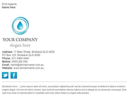
Including a business signature helps to maintain the professional tone of the message. It should include the author’s name, position at the company, name of the company, and the company’s website URL. Other elements that can (and should) be present in a signature include contact information, such as phone number, Skype name, or link to a professional social media profile. Taken all of this into account, it is important that the signature does not appear heavyweight. The optimal number of lines is between 3 and 5, as suggested by experts.
Using graphics
According to multiple sources, adding a company’s logo makes an email look more professional. It increases trust to the author as a representative of an organization. However, including a logo would mean that the entire signature should be aligned with it in terms of size, fonts, and colors. Using corporate colors and fonts is both a safe and stylish way to generate a signature. One of the graphic objects to include in a business signature might be a banner. It can be a promotion of the company’s product, an invitation to learn more about the business, or a link to a resource that the recipient might find useful.
Simplicity and brevity
Too big or too vivid signatures can turn an addressee away from the message contained in the email. Normally, a signature should not exceed the size of the email text. It should be written in a smaller font and not be overly bright. It is recommended to stick to a certain color palette and a single visual style. Flashy banners should be avoided as well.
Also read: how to write a business paper
A note on quotes
Inserting a quote at the end of the email can provide a misleading message to a recipient. Despite the fact that quotes, especially image quotes, have been largely popular and highly shareable on social networks, they tend to play a rather negative role in business correspondence. Some perceive quotes as too abstract, while others treat them as overgeneralized pieces of common wisdom. Moreover, if a quote belongs to a politician or another public figure, there is no guarantee that this person is positively perceived by everyone.
In order to send professional emails, one has to beware of both the visual and the content parts of the message. This also concern the closing part of an email. A business representative who corresponds with either potential clients, partners or colleagues, should make sure that a closing line and a business signature are present at the end of the email. While closing parts can be highly individual for everyone, the basic elements to include are a person’s job position, contact details, and an element of corporate identity (such as a logo or a banner).


